Exciting news everyone! We’ve got a new look.
You might be wondering…why change?
Generally speaking, rebranding is a marketing strategy that helps build up a company’s image. At the same time, rebranding can be used to support the upgrading of the company’s products and services.
Many thanks to you of course but this really indicates that our company, with your support, has progressed and is prepared to reach much much greater heights.
Let’s get more specific.
Why did Prosperna rebrand?
For us here at Prosperna, our primary reasons were:
- Because of the Prosperna team’s shared belief that change and innovation is good;
- To move towards progression;
- Because of the growing number of the Prosperna Community;
- And to make the new design of the brand cohesive with the upgraded features that Prosperna customers are looking for with our website and mobile app.
- Inevitability of Change
We, at Prosperna, share the same belief that change is unavoidable and innovation is good. Changes are bound to happen, especially to a team comprised of creative and like-minded individuals. Change is a really good thing because it means that we’re moving forward, we’re evolving, and helping our community during the process.
- Sign of Progress
Without change, progress would not be possible. At Prosperna, we absolutely want to make progress, so the most logical and smartest thing to do was to embrace the promise of inevitable change. Rebranding Prosperna is just a step towards progression. Progress, for us, means making a positive impact on the professional and personal growth of our team members and of our customers.
According to John C. Maxwell, “Change is inevitable. Growth is optional”. This much is true – we want to grow by helping you grow your business. Being go-getters, the Prosperna team decided to revamp the brand’s design and decided to improve as early as we can, as a way of saying that we’re also upgrading as a business.
- Growth of the Prosperna Team
As our team at Prosperna continues to become bigger, better and stronger, we wanted to improve our products and services. The team took rebranding and upgrading the features of Prosperna’s website and mobile app as a challenge to not only improve our brand but also as a challenge and an opportunity to grow professionally. Our team, which is a mix of skilled and innovative individuals, continues to improve as a team, and rebranding is just an indication that we are evolving and soaring to greater heights.
- Cohesiveness of the Website and Apps’ Features with the Brand’s New Design
Because we’re always creating new features and enhancements of our products, it was only fitting that we also revamp our brand to make room for expansion.
By upgrading our brand and its features, your experience will be much more efficient and much more pleasing to the eyes.
A pleasing brand, website design, easy and better navigation, as well as upgraded and efficient features… what more can you ask for?
Well, you can find all of these and more in Prosperna 2.0!
The Prosperna Logo
When we say, “out with the old and in with the new”, it literally means to advance or to move forward. That’s so apt with Prosperna’s rebranding and upgrades on its features. We’re moving forward. We’re heading towards digital advancement.
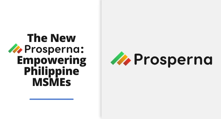
Before we introduce our new Prosperna logo, let’s take a look at our old brand. With its simple and sleek design, it has definitely served us well and has seen us through a wonderful period of time of working as a team and serving our valued clients.

Introduction of the New Prosperna Logo

Now, on to the “new”.
We’re SUPER proud to present to you our new Prosperna logo!
In contrast to our old logo, our new logo gives us a fun, simple, and vibrant vibe but backed by a powerful business focus. The colorful dots add character to the logo and represents the creativity of the team. The red, yellow and green dots represent how Prosperna, as a team, as a business, and as a platform will help you grow your business.
New font
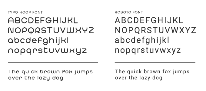
The Prosperna 2.0’s font’s goal is to have that modern, yet friendly feel, so we decided to got with the Typo Hoop as the main font and Roboto as the secondary font. The new fonts’ geometric features and open curves appropriately fit Prosperna because the company is an online digital platform that does business in a professional and approachable manner. Aside from the modern design of the fonts, we chose Typo Hoop and Roboto fonts because for us here at Prosperna, these rounded thin fonts represent friendliness, kindness, and a fun-loving nature that’s easy to work with.
Color palette
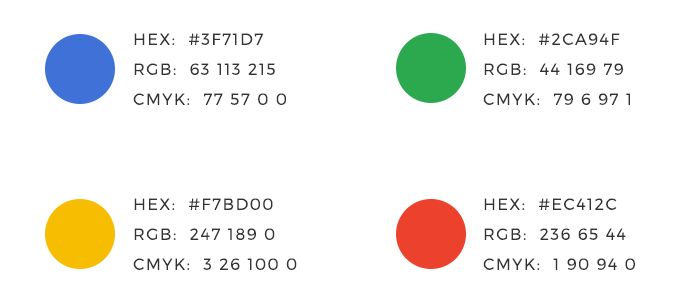
The color palette is essential in the general aesthetic of a website and mobile app. We wanted Prosperna to look simple yet really vibrant and pleasing, so we used three primary colors (red, yellow, and blue) and a secondary color (green). Our aim is for our brand’s design and website to be as eye-catching as possible while giving us options for expansion.
Achieving a Milestone at Prosperna
Changing the brand’s design and turning it into Prosperna 2.0, is another milestone we’ve achieved. This is just the beginning of something new for the Prosperna team, as well as the clients who continually embrace and support our products and services.
We’re beyond excited for our brand’s new look and Prosperna’s upgraded features to help you sell smarter, faster and build better relationships.
To our most valued customers, thank you for your continued support and we hope you would continue entrusting us with your digital and online real estate marketing needs.
To experience the newly upgraded Prosperna app, you can sign up here for FREE. You’ll surely be impressed as we’ve not only changed our branding, but we’ve also upgraded the overall performance of the app.
Enjoy…Prosperna 2.0!!
